
Snap
&
Go
From Rough Wireframes to a Cohesive Product
INTRO
Snap&Go is an AI-powered shipping app designed to make shipping high-value items as simple as taking a photo. When I joined, the product was still taking shape, with incomplete wireframes, evolving requirements, and key flows that needed to be worked through.
The team needed: a clearer product experience, a foundation that could support development, and a visual direction that could make the new product feel cohesive and credible.
The timeline was tight and the requirements continued to evolve. I took the existing concepts and rebuilt the main flows, filled gaps in the experience, reduced friction across interfaces, and established the product’s initial design system and visual direction.
As the product evolved, I continued refining the experience across onboarding, shipping, tracking, profile, and rewards. The goal was to turn an unfinished set of ideas into a more complete, consistent, and usable product experience ready for development and further iteration.
ROLE
Sole Product Designer, Freelance
STATUS
Shipped 2025
TEAM
Product Owner, PM, Engineers
TYPE
Startup, B2C, Logistics
TOOLS
Figma, ChatGPT, Claude, Framer
Problems
The initial wireframes had gaps, inconsistent flows, and requirements that continued to change. Key product decisions still needed to be worked through before the experience could move forward.
Solution
I rebuilt the core flows, filled missing states and interactions, reduced friction across screens, and established an initial design system and visual direction to keep the growing product consistent.
Results
Snap&Go evolved from a rough set of screens into a more cohesive product experience, with defined core flows, reusable UI patterns, and a stronger visual identity ready for development and further iteration.
Screenshot gallery


Process
DESIGN CHALLENGE
How do you turn a complex shipping process into a simple experience when the product itself is still being defined?
There was no complete blueprint to follow. The initial wireframes had gaps, requirements were evolving, and many interactions still needed to be figured out. Instead of simply polishing the existing screens, I focused on building the experience around the core promise: take a photo, let AI handle the complexity, and make shipping feel simple.
I leaned heavily on:
UX heuristics to identify friction and inconsistencies
Flow mapping to rebuild the core experience and uncover missing states
Existing shipping knowledge and product requirements to make informed decisions
Incremental iteration to refine flows as requirements evolved
Design system thinking to keep the growing product consistent
ISSUE #1
Core flows were incomplete
The initial wireframes covered the main screens but left important interactions, states, and steps undefined. This made it difficult to understand how users would actually move through the product.
I rebuilt the core flows around the new requirements, mapped missing states, and connected the experience from onboarding → shipping → tracking → account.
ISSUE #2
Too much complexity was exposed to the user
The product was built around AI automating the shipping process, but the interface still required users to understand too many details and decisions upfront.
I simplified the experience by reducing unnecessary steps, improving hierarchy, and surfacing information progressively so users could move forward without needing to understand the underlying shipping process.
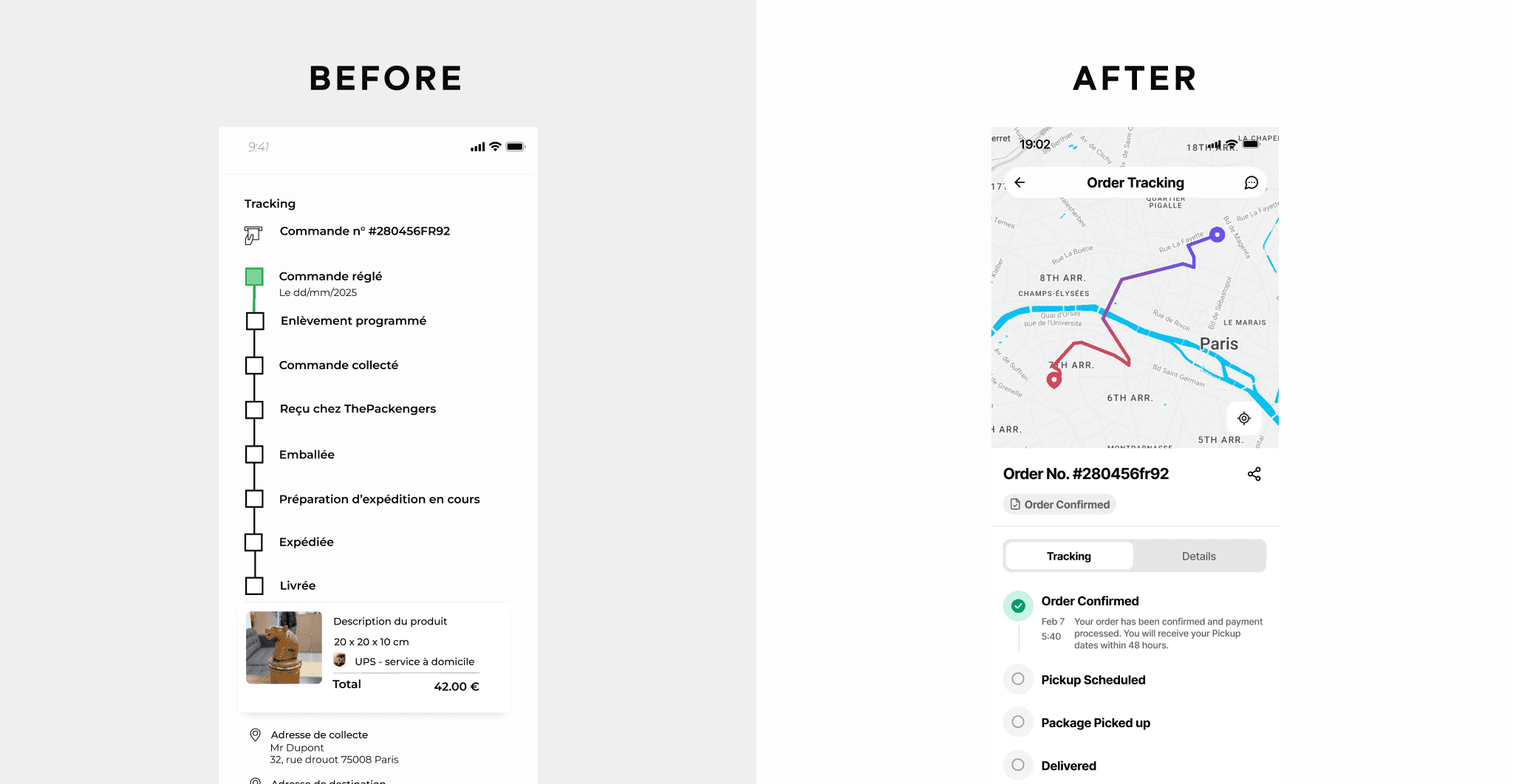
ISSUE #3
Missing screens, states and edge cases
Throughout three design iterations, I uncovered gaps in the existing flows and designed the missing screens, edge cases, and states needed to create a complete end-to-end experience.

ISSUE #4
The product lacked a consistent visual foundation
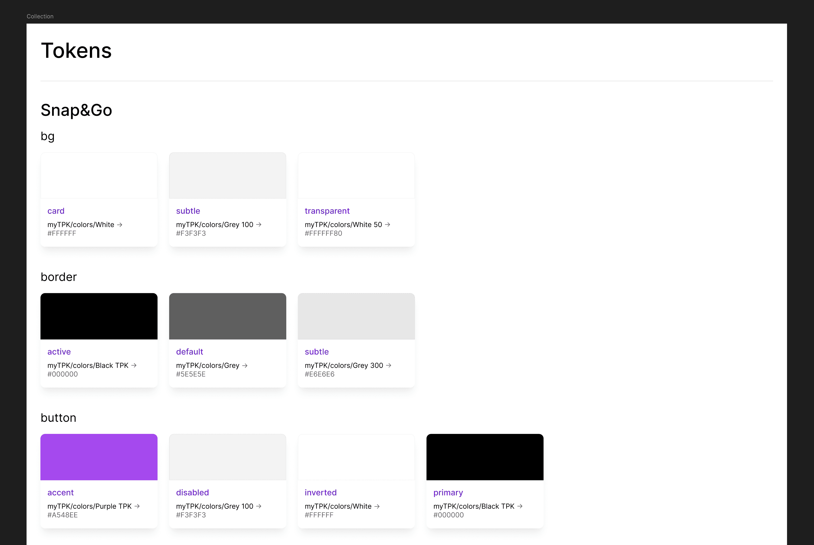
The growing number of screens made inconsistencies in components, spacing, typography, colors, and interactions more apparent. There was also no established visual identity for Snap&Go.
I created the initial design system and visual direction, then applied it across the product to improve consistency, polish, and establish a recognizable Snap&Go brand.
Product Enhancements
01. Multi-product shipping
Designing Beyond the Happy Path
The initial requirement was to let users add more than one product to a shipment. I mapped the entire interaction, including adding and removing items, adjusting quantities, handling permissions and limits, and placing insurance values. I also designed tooltips, toasts, and confirmation modals to guide users through errors, cancellations, and unexpected actions.

02. Delivery details
Keeping Users Focused on One Step at a Time
The order flow required users to complete several sections, including pickup, delivery, and billing details. I introduced auto-collapsing sections so completed steps could move out of focus while the active section remained prominent. This kept the interface more organized and helped users concentrate on the information they needed to enter next.

03. Guided onboarding
Teaching Through the Product
Instead of relying on disconnected marketing-style messages, I reworked onboarding to demonstrate how the app actually works. The goal was to help users understand the key actions and value of the product through relevant guidance, making the first experience more useful and easier to follow.
04. Delivery scheduling
Connecting Shipping With Delivery Scheduling
I incorporated scheduling into the order experience to connect the shipping process with delivery coordination through Loopengers. This helped establish a clearer path between creating a shipment and arranging its delivery, while accounting for the scheduling requirements of the wider product ecosystem.

Beyond the MVP
Snap&Go landing page
The MVP need a landing page for its launch. I designed and developed it solo in framer. The page has custom animations, QR links to download, CMS for types of items eligible for delivery and default pages like contact us and FAQs all fully responsive.

Results
Outcomes
A more intuitive and scalable MVP that aligned business objectives with a consistent, user-centered experience, making future enhancements easier to support.
What's Next?


